SPY HIGH DOCUMENTARY - MOTION GRAPHICS PITCH WORK
CREATIVE DIRECTION
HEY BEAUTIFUL JERK
Animation, Design
David Manzo
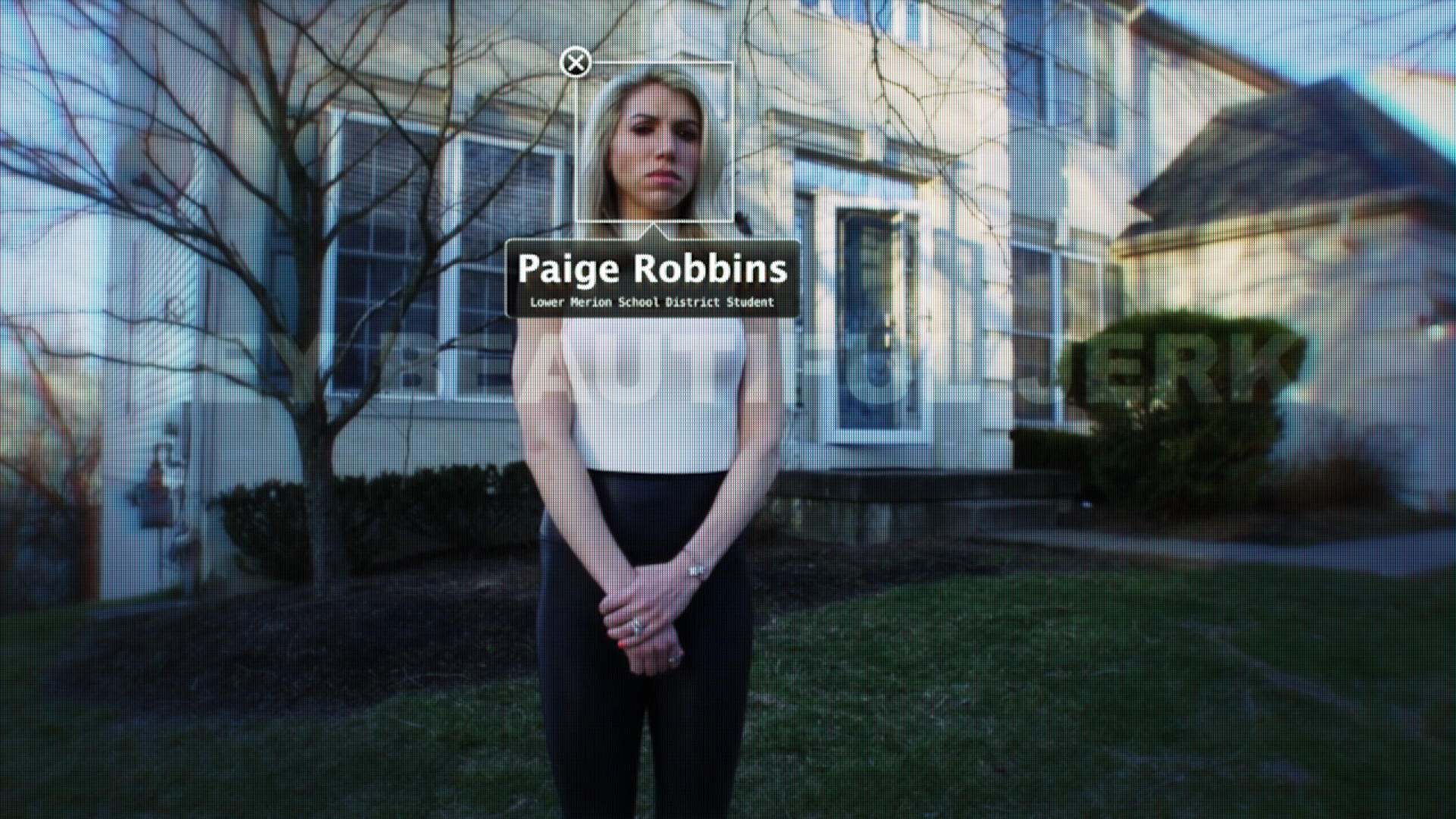
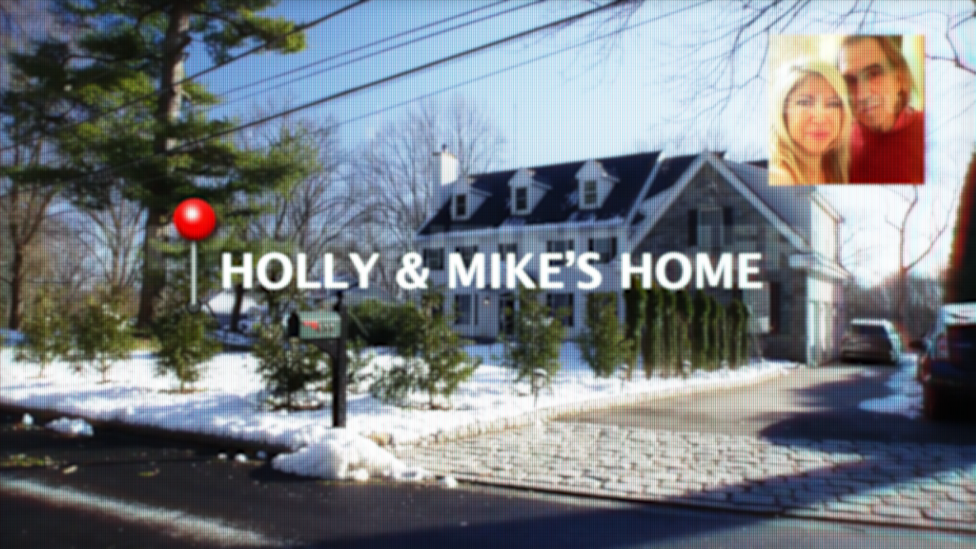
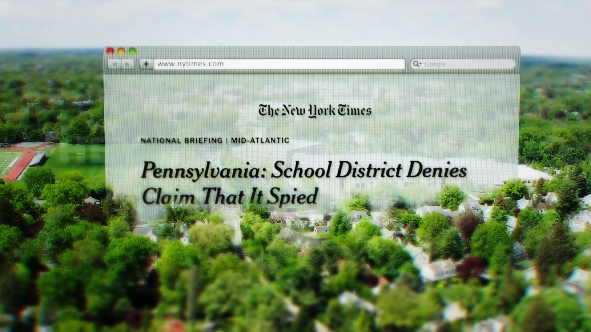
With this story taking place during the early 2000s and the emergence of Apple tech being a major part of the insane story - we chose to include the early Apple style in the overall look of our graphics pitch.
A combo of the Apple OS fonts along with the Photo App and Map App UI used in that OS (2009 - 2010). This felt like the perfect opportunity to merge the look and feel of the digital design of the period with a little bit of a modern touch.